Our Work
SPRA
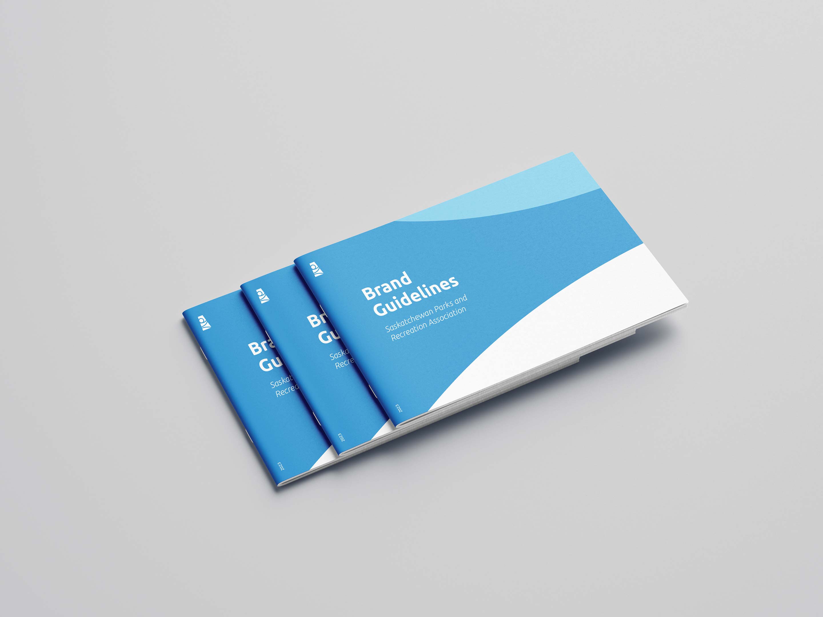
Saskatchewan Parks and Recreation Association | Branding
Like a well-marked trail, a strong brand should be clear, consistent, and easy to follow. BT helped the Saskatchewan Parks and Recreation Association uncover areas of opportunity and create a cohesive identity that would keep them on the right path.
CHALLENGE
SPRA’s brand had evolved, but their logo and guidelines hadn’t kept up. It was time for a refresh that gave them a foundation for the future.
IDEA
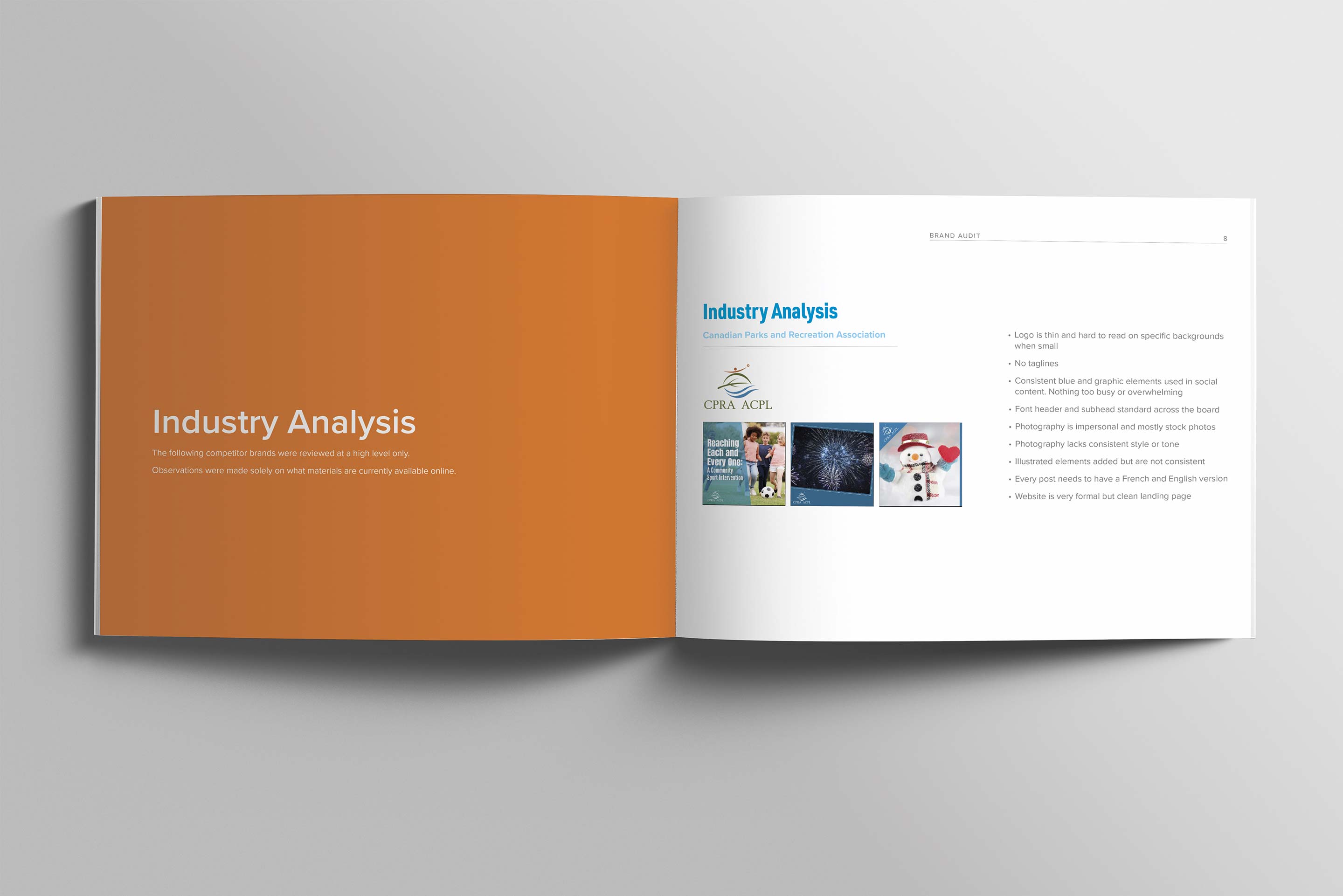
Keep what works, refine the rest. Dive deep into the brand with a comprehensive audit to uncover the best path forward.
EXECUTION
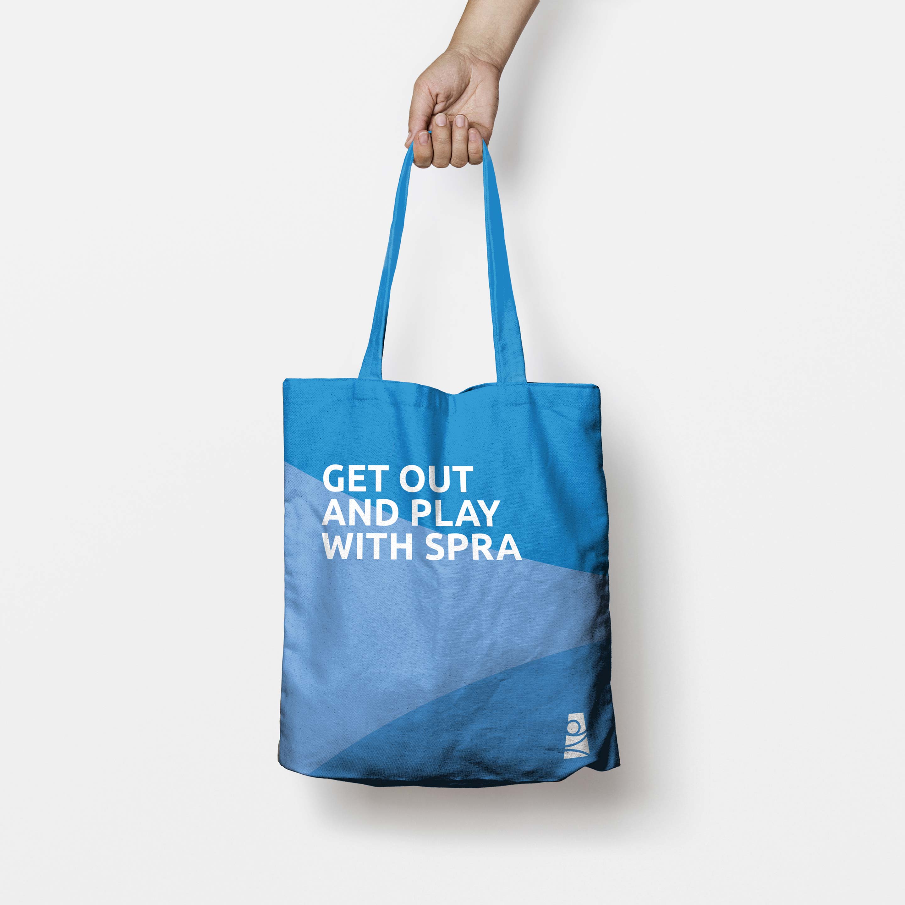
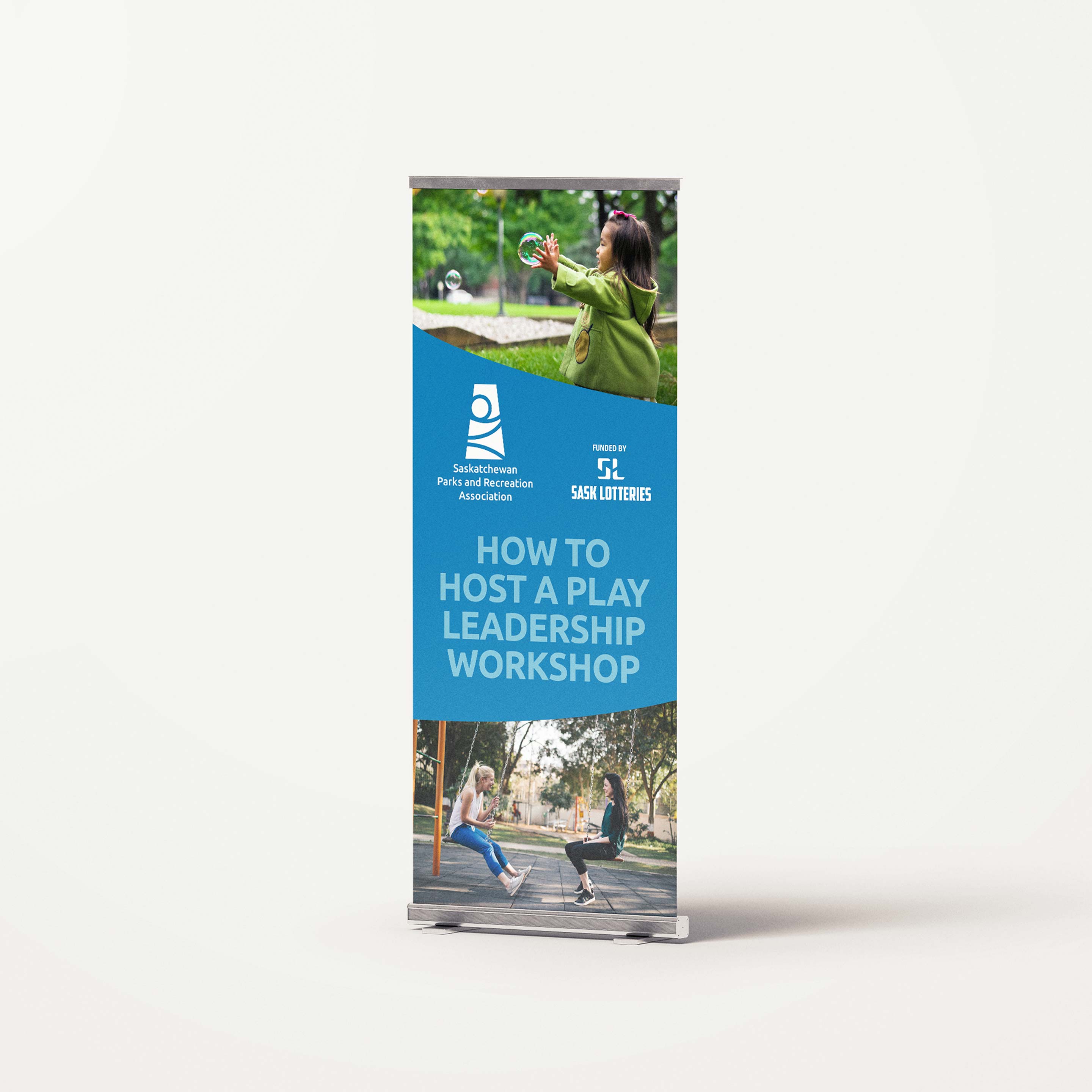
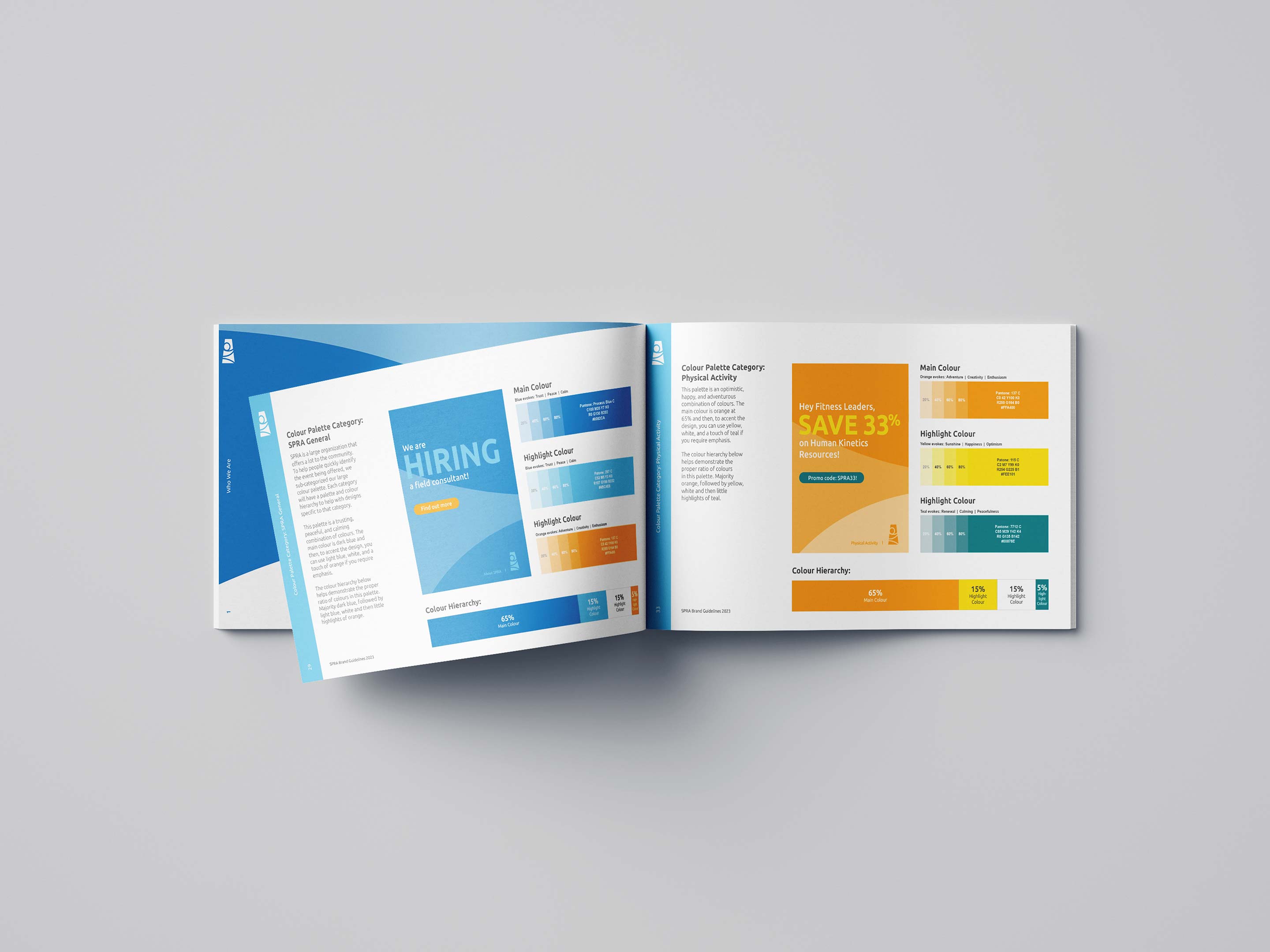
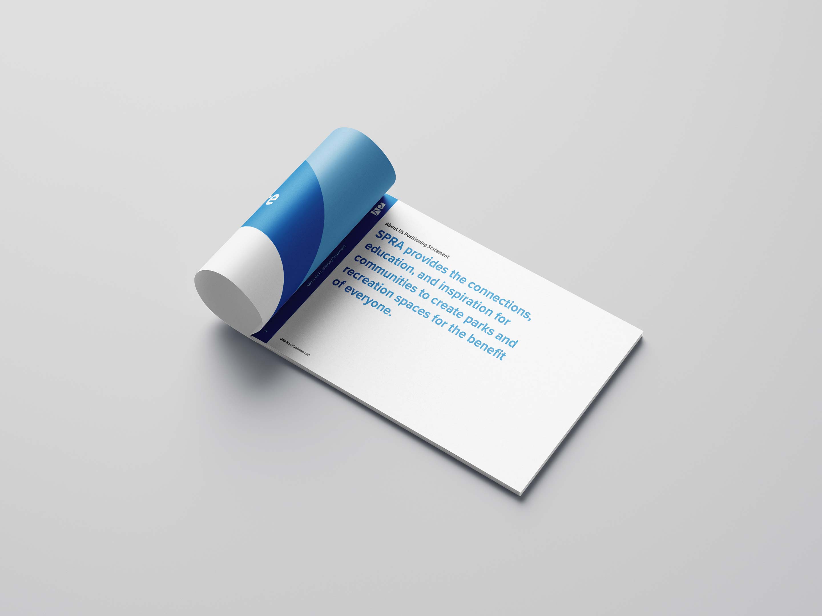
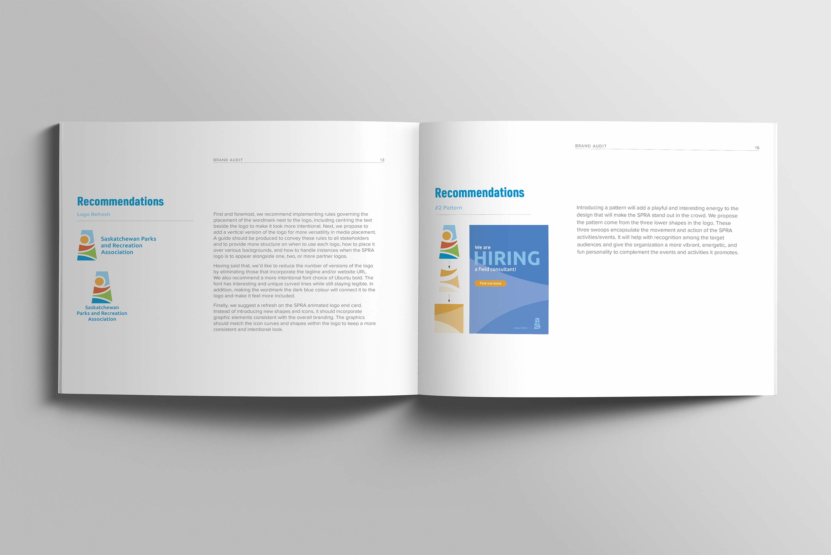
Guided by our brand audit, BT refreshed SPRA’s logo while maintaining its recognizability, then built out a full set of brand guidelines to ensure consistency across all materials. We covered logo variations, fonts, colors, tone, and more – delivering a clear framework for a cohesive brand presence.