Our Work
SaskFit
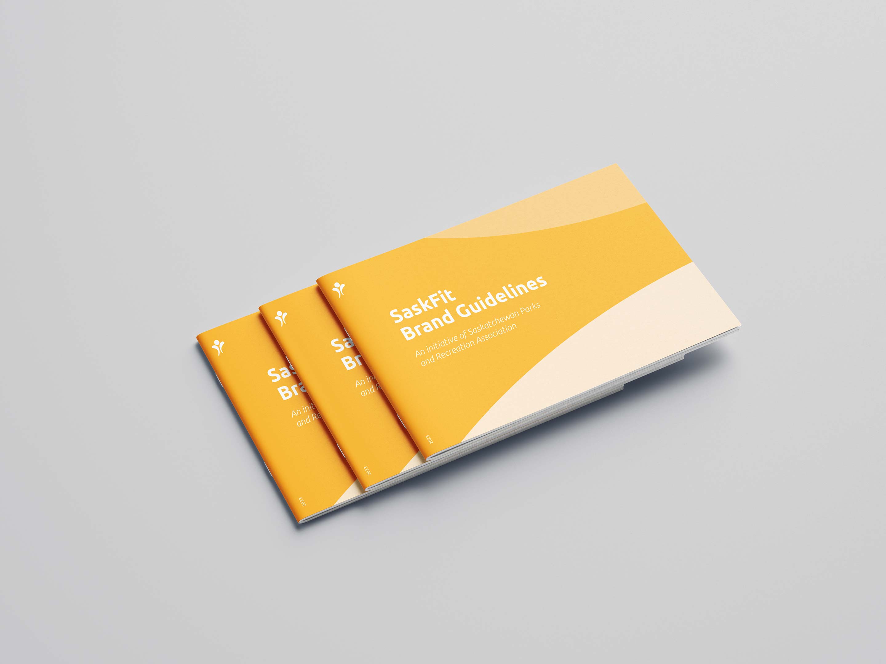
SaskFit | Branding
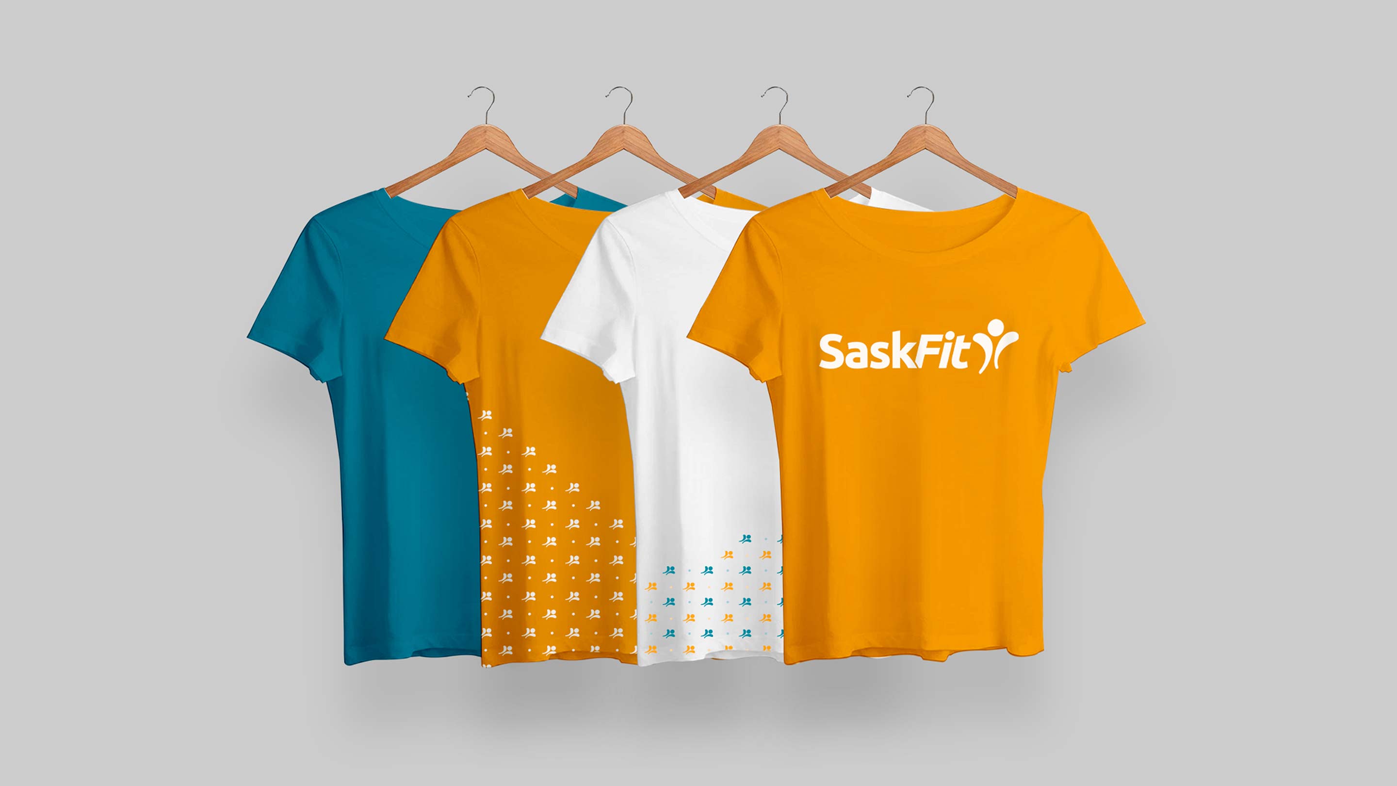
After years of hosting Saskatchewan’s top fitness conference, SaskFit’s branding was in need of some conditioning. This long-running fitness conference had never refreshed its brand identity – until now.
CHALLENGE
SaskFit’s outdated look didn’t reflect its status as a top-tier fitness conference – it was time to get in shape.
IDEA
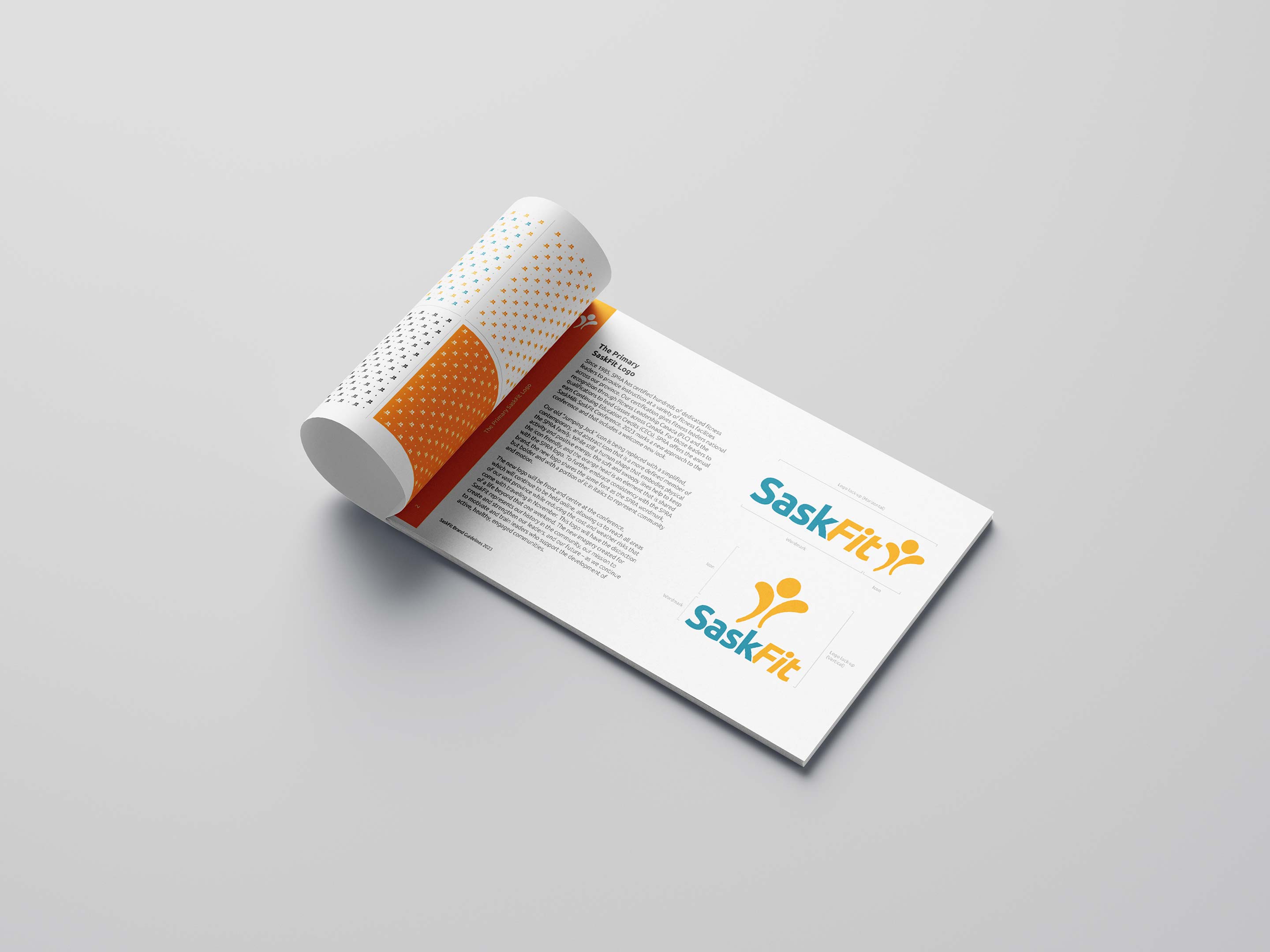
As a key part of the Saskatchewan Parks and Recreation Association’s offerings, SaskFit needed to stand out while still feeling like a natural extension of the main brand.
EXECUTION
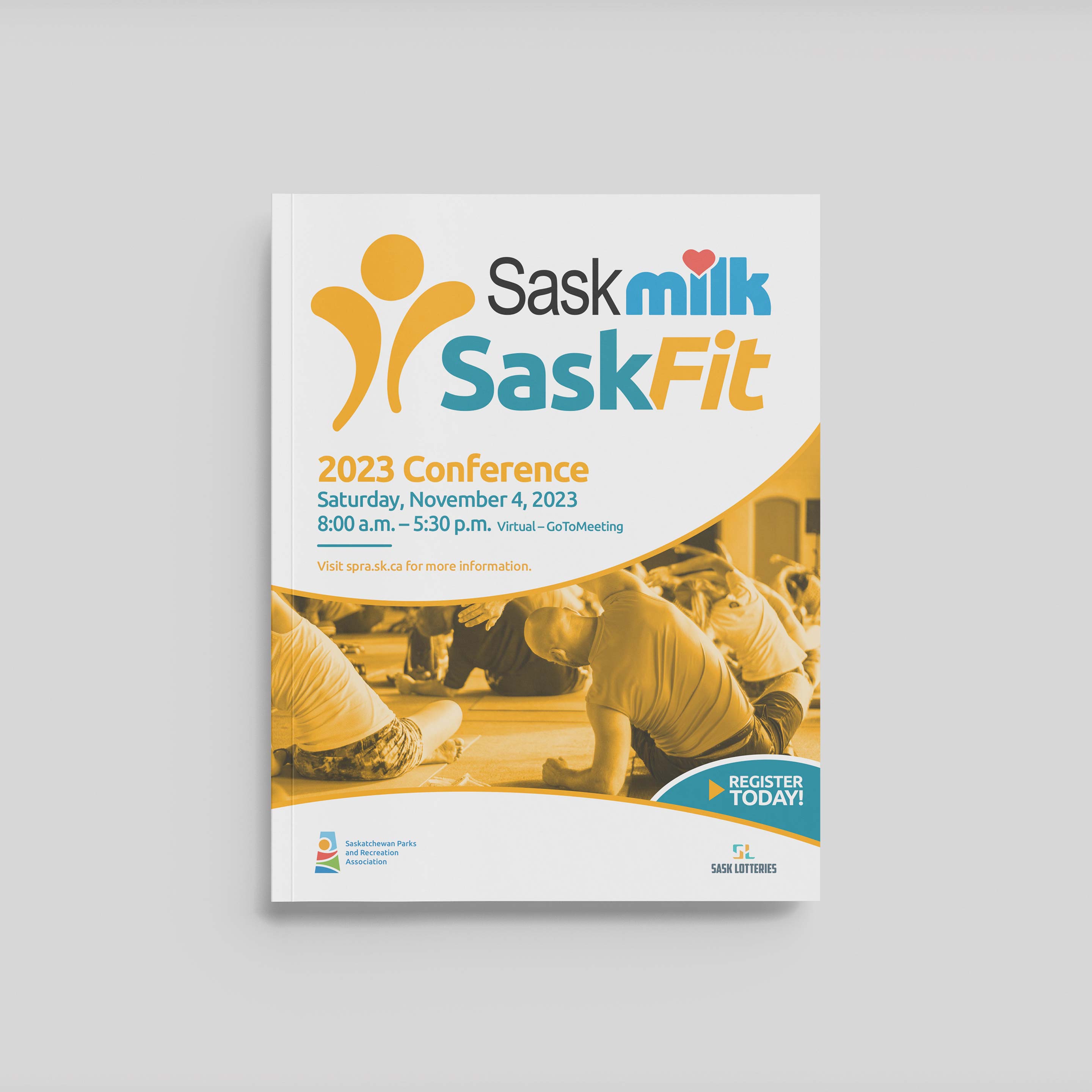
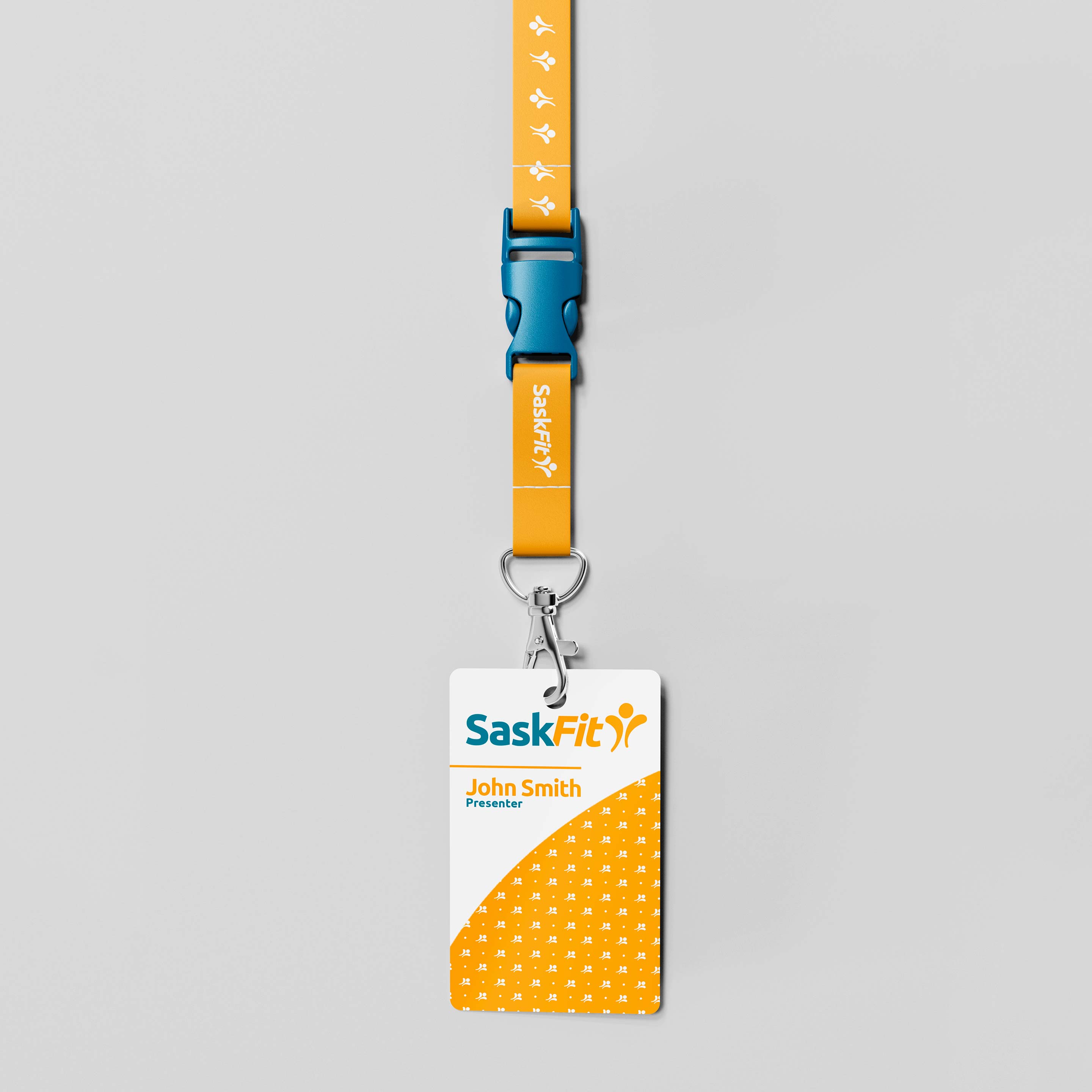
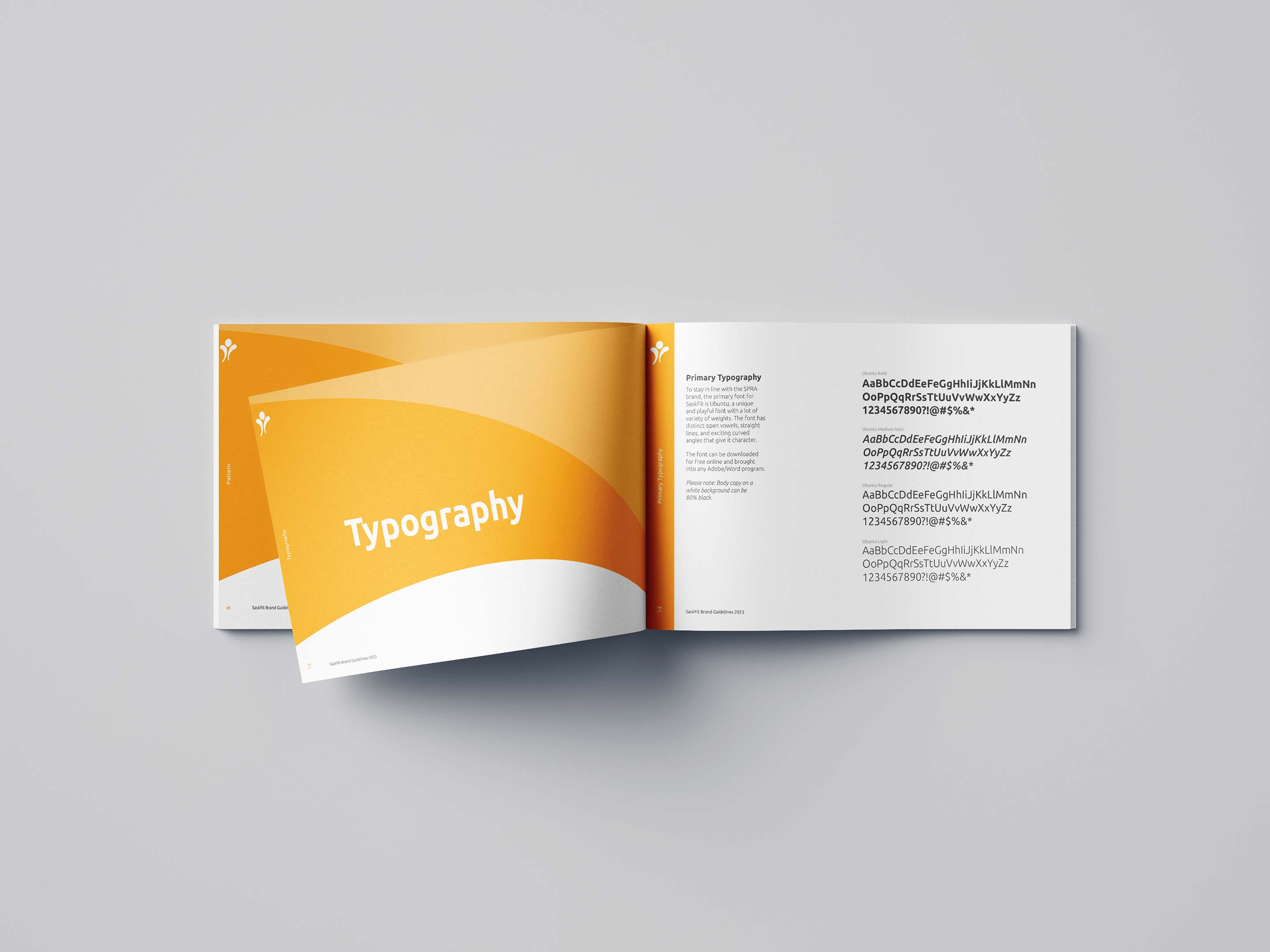
We designed a refreshed logo, applied SPRA’s typography, and introduced bold orange and turquoise to give the brand a strong, active presence.